
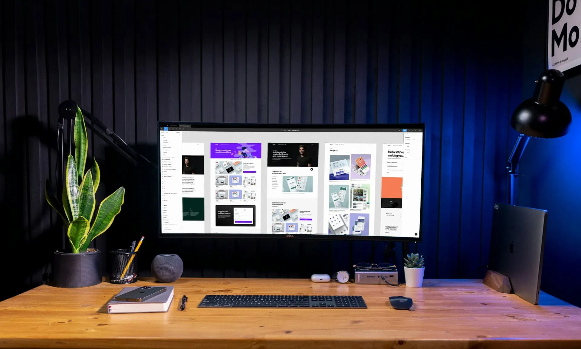
Many people use their phones to search for businesses, read articles, or shop, so a mobile first website is essential. Visitors expect a site that loads quickly, looks neat, and makes it easy to tap buttons without needing to zoom in. If your site isn’t simple to use on a phone, users will move on. Slow load times or a cluttered layout can drive people away. Working with skilled local web design services can help shape your site to guide visitors toward actions like sending a message, booking a service, or calling. These ideas can help you plan or update your mobile site with ease.
Start with the Mobile Experience in Mind
A great mobile site isn’t just a shrunken version of a desktop page. Instead, it is built from scratch to fit small screens. Start with the smallest screen and then scale up the design for tablets and desktops. This approach ensures you focus only on what matters most to your users.
- Begin with the smallest screen size and build up from there.
- Make sure buttons are large enough and spaced out for easy tapping.
- Choose clear, readable fonts with ample spacing between lines.
- Test the design on real devices to catch issues that might not appear in previews.
This mobile-first mindset helps create a site that feels natural for users no matter how they browse.
Keep Things Fast and Light
When people use their phones, especially during indoor times like winter days, they are not prepared to wait for slow-loading pages. Heavy images, excessive videos, or complicated animations add lag that can cost you valuable visitors. Keeping your site fast and light is key.
To avoid slowdown:
- Compress images carefully so they still look sharp.
- Avoid autoplay videos unless they add clear value.
- Use simple layout effects that don’t weigh down the page.
- Steer clear of pop-ups that cover the screen and frustrate users.
A fast website not only keeps visitors engaged but also creates a smooth browsing experience that invites further exploration.
Guide Visitors With Clear Actions
Once visitors land on your mobile site, they should immediately see what steps to take next. Clear calls to action help direct the user without making them work too hard.
Consider these tips:
- Place a clear action, such as “Call Us” or “Schedule a Visit,” in a prominent position on the page.
- Use buttons that are easy to tap and have labels that clearly state the next step.
- Highlight important information like operating hours, location, or contact details so users don’t have to search for them.
A straightforward layout that gently guides visitors can help boost engagement and conversions without overwhelming them.
Make Navigation Easy to Use
Navigation on a mobile device needs to be simple and well organized. A confusing menu can deter users from exploring your site further. Keeping navigation short and clear makes a big difference.
Here are a few ideas:
- Use a collapsible ‘hamburger’ menu that keeps the page uncluttered but is easy to open.
- Limit the number of links in the menu so that only the most important pages are featured.
- Design the flow so that visitors can reach key sections in two taps or less.
- Test your navigation on real phones to ensure it feels natural and responsive.
A streamlined navigation system means users can move quickly from one section to another without getting lost.
Keep Your Content Mobile Friendly
Content for mobile users should be concise and easy to digest. With smaller screens, long blocks of text can feel overwhelming. Structuring your content so that it fits well on a phone is essential for keeping readers interested.
Try these techniques:
- Write short paragraphs that can easily fit on a phone screen.
- Break up text with clear headers and bullet points to guide the eye.
- Choose images that are cropped and scaled to display properly on smaller devices.
- Work with local web design services to ensure content blocks adjust automatically based on screen size.
By keeping your content crisp and well-organized, you help visitors quickly understand your message without feeling overloaded.
Helping Your Website Do More On-the-Go
A mobile-first website isn’t just about fitting content to a smaller screen, it’s about creating an experience that keeps visitors engaged wherever they are. A well-designed mobile site turns occasional visitors into loyal fans by making navigation effortless and actions simple.
When your site is optimized for mobile:
- It loads quickly even on slower connections.
- The layout is intuitive enough that users know where to click or tap.
- The design reduces clutter, so the important parts of your message are clear.
- Every element, from images to text blocks, adapts smoothly to different screen sizes.
These small details contribute to a big picture: a site that functions beautifully on the go. Visitors who enjoy a smooth experience are more likely to stick around, explore further, and eventually convert into customers.
Mobile first design means rethinking traditional website building. Instead of adapting a desktop page to a smaller format, every detail is considered from the start to suit mobile behavior. By focusing on speed, clarity, and simple navigation, even complex ideas can be presented in a way that’s gentle on the eyes and easy to follow. This thoughtful approach results in more than just a mobile-friendly site, it creates a digital space that feels welcoming and efficient, encouraging users to take that critical next step without hesitation.
Attention to load times, tap targets, and clear content is essential. Even small tweaks, like reducing image file sizes or rearranging menu items for efficiency, can make a significant difference in user satisfaction. The goal is to remove any friction that might cause a visitor to click away. Instead, every element on your mobile site should help guide the user effortlessly through your content.
When you work on mobile first, you design with the understanding that many visitors may only interact with your site through their phone. This means every decision, from font choice to button spacing, has a purpose. By keeping things light and focused, you make sure that nothing distracts from your main message. The result is a website that not only meets modern expectations but also provides a little extra boost when it comes to usability and overall appeal.
Ready to improve your site with a seamless mobile experience? Partnering with experts who understand every detail, from intuitive navigation to quick load times, can make all the difference for your visitors. That’s why we recommend working with professionals who specialize in local web design services that prioritize mobile needs. At Market Design Team, we create websites built for people, making sure your audience enjoys every visit. Contact us today to get started.